HSBC
When someone loses a loved one, the last thing they need is a confusing process. When dealing with loss, users often struggle to find clear guidance and emotional reassurance in digital services. The question driving this project: how might we design a digital experience that delivers genuine empathy while still providing clear, practical support throughout a highly sensitive service journey?
Duration
May-Aug, 2025
Client
HSBC Australia
Services
#
UX Research

Challenge
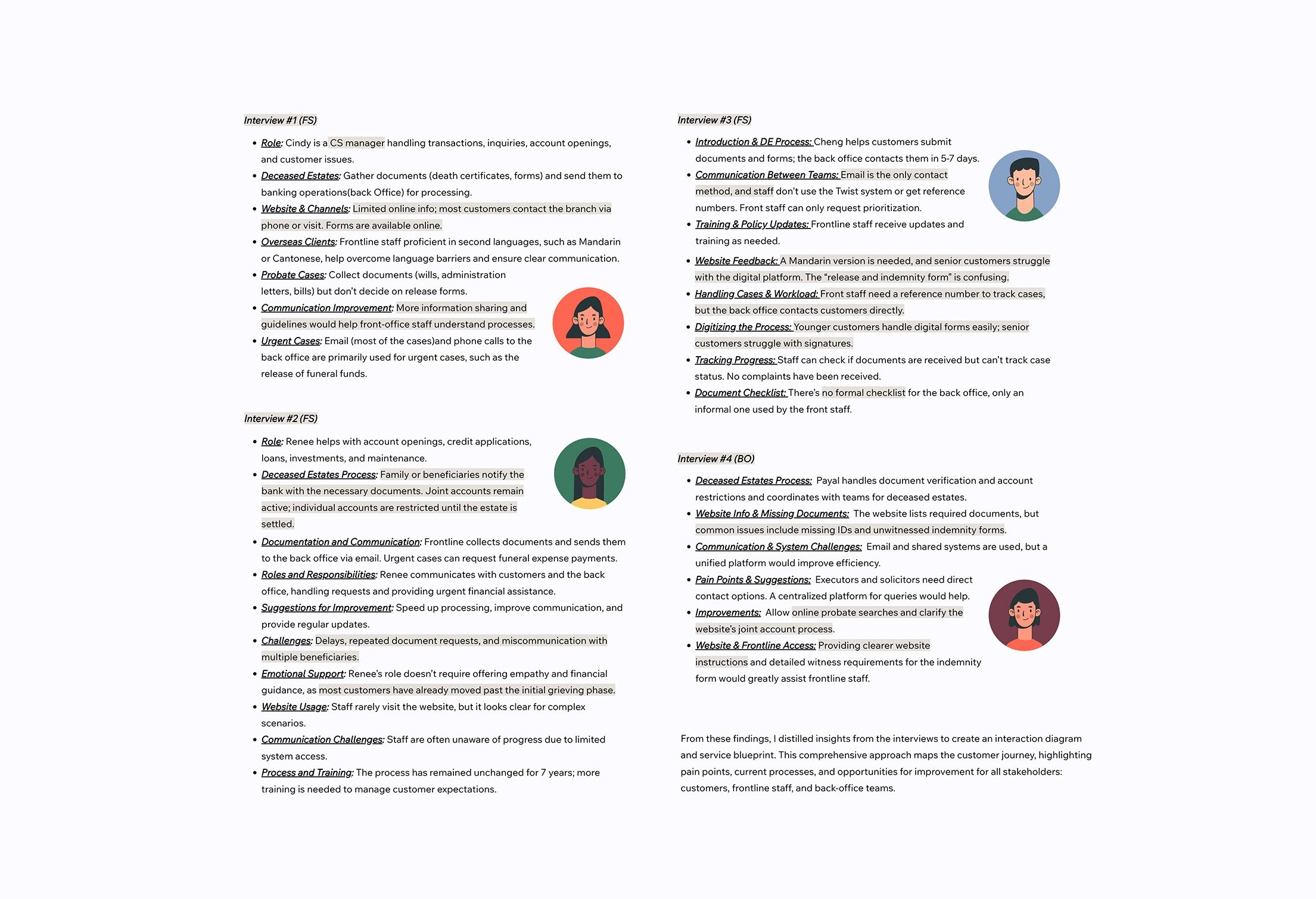
To understand the full scope of the problem, we opened with a stakeholder interview with the Head of Deposits, FX & Payments, then conducted four in-depth interviews across frontline and back-office roles — covering end-to-end processes, pain points, customer interactions, and training gaps.
What surfaced was a consistent picture. Customers and staff alike lacked visibility into case progress, leading to confusion and repeated enquiries. Complex legal language and text-heavy content created real barriers, especially for non-native English speakers. And inconsistent document handling across fragmented systems was driving errors, rework, and delays on both sides.
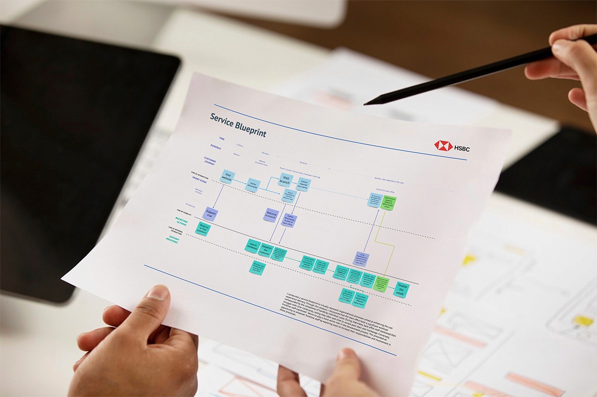
Mapping the end-to-end service flow made the breakdown visible. Email was the primary channel between customers and the back office, making case progress nearly impossible to track. Frontline staff had limited insight into back-office operations, leaving them unable to give customers clear answers. Complex cases could take weeks — sometimes years — to resolve.
The process was thorough by design, built for accuracy and compliance. But that same thoroughness was creating long waits, operational bottlenecks, and a frustrating experience for customers navigating one of life's most difficult moments. The central tension: balancing regulatory rigour against speed, transparency, and genuine empathy.


Solution
Three recommendations emerged, each targeting a different point of failure.
1. Shift work earlier, not add more of it
The process only began meaningful assessment once documents reached the back office — too late. The fix: empower frontline staff to initiate case setup proactively, and introduce a shared checklist for both customers and staff covering required documents, step-by-step guidance, and screening questions. Capturing data earlier reduces rework, closes information gaps, and builds trust at the very first touchpoint.
2. Make the wait visible
Customers had no idea where their case stood or how long it would take — driving repeated status enquiries and unnecessary anxiety. The recommendation: a visual progress tracker showing key stages, estimated durations, and current case status. Customers first select the product types held by the deceased; the system then calculates a timeline based on departments involved, compliance requirements, and historical data. Transparent timelines turn uncertainty into confidence.
3. Learn from who's already doing it well
Benchmarking three institutions surfaced clear, transferable patterns — Westpac's empathetic storytelling and accessibility features, Metro Bank's logical sequential structure, and ANZ's frictionless one-click access to forms. These distilled into three design principles that now guide the work:
Empathy-driven design — human language, compassionate tone, psychological safety
Radical clarity — step-by-step flow, visual hierarchy, upfront summaries
Accessibility by default — Easy English, readable layouts, simple navigation


Impact
Mentor evaluation highlighted strengths in discovery, resourcefulness, agile collaboration, and empathy — reflecting design capability at a Midweight to Senior level.
This project was research-led rather than design-led, which meant the real test wasn't visual execution but communicating insight clearly enough to build a compelling case from evidence alone. That was new territory, and it sharpened a different muscle.
The clearest takeaway from the whole project: when a system lacks transparency, the burden doesn't disappear — it gets transferred to the user. For someone already navigating grief, every unclear step, every unanswered question, every repeated form adds emotional weight that good design could have prevented. Designing for emotionally vulnerable users isn't about tone or visual warmth alone. It's about removing uncertainty — because in those moments, uncertainty is its own kind of harm.